
Geotense– A modular typeface accompanied by a minisite
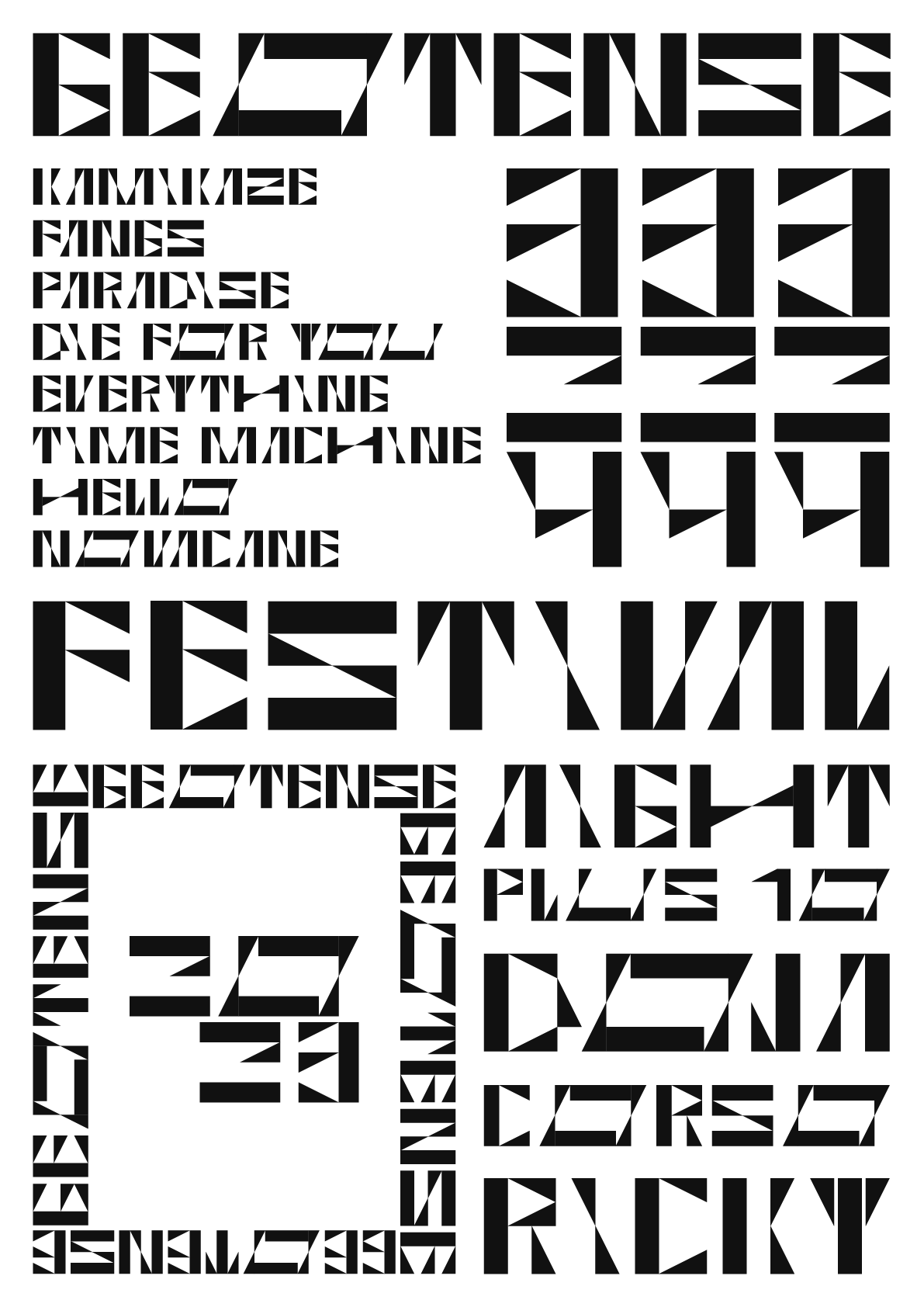
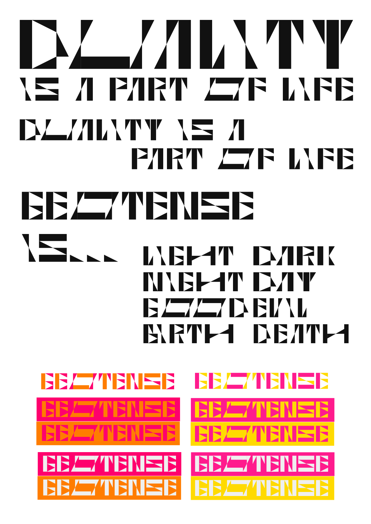
Built from only two modules—one of which is a triangle, chosen to introduce greater dynamism—Geotense evolved into more than just a typeface. Over time, the triangle came to represent duality and intense energy, giving the system both visual and conceptual depth. To balance this intensity, the color palette emphasizes playfulness, highlighting the experimental spirit behind the typeface’s design while maintaining that energy. The minisite showcases the font in an interactive, scroll-based format, allowing the type to live as both a functional system and an expressive visual language.
Purpose & Goal.
Purpose & Goal.
This two-part project, completed for an Advanced Type course, focused on exploring the relationship between modular design and digital presentation. The first component involved developing a modular typeface using only two to three base shapes, challenging me to think critically about structure, repetition, and form. The second component extended the project into the digital realm through the creation of a single-scroll minisite designed to showcase the typeface in use.
From the beginning, I aimed to create a geometric system that felt both structured and expressive. I chose to work with a complex module—specifically a triangle—to introduce a sense of dynamism and visual tension within the grid. The goal was to build a typeface that has high tension while being readable and to design a digital environment that reflected the same spirit of experimentation and play.

Process.
Process.
First Draft
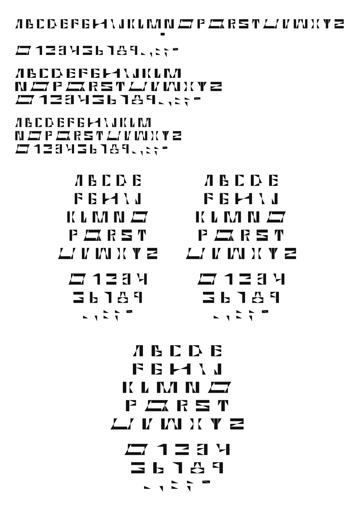
This was my first exploration into modular type design, and the learning curve was steep but rewarding. Initially, I overcomplicated the system—starting with a square and a triangle, then breaking those down into smaller shapes until nearly every letterform was composed of micro-modules. While this approach made sense to me, it quickly became too intricate to remain truly modular. After feedback from my professors, I refined the system to use only a few core modules, giving the typeface a stronger sense of structure and consistency. This simplification allowed me to focus on composition and balance, ensuring that the negative space played an active role in readability. Through this process, I discovered how restraint and clarity could strengthen both the visual rhythm and overall legibility of the design.


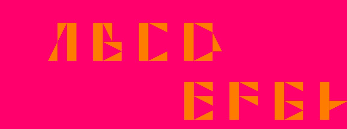
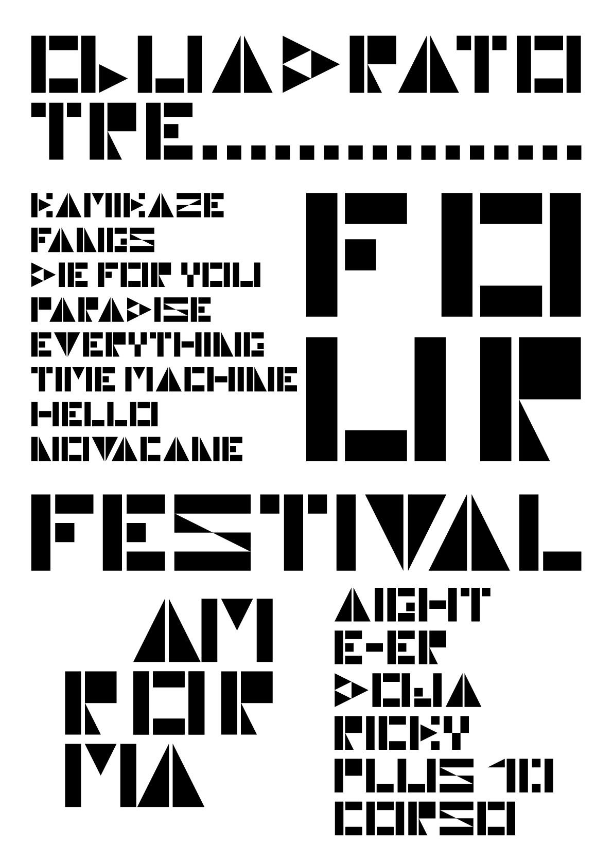
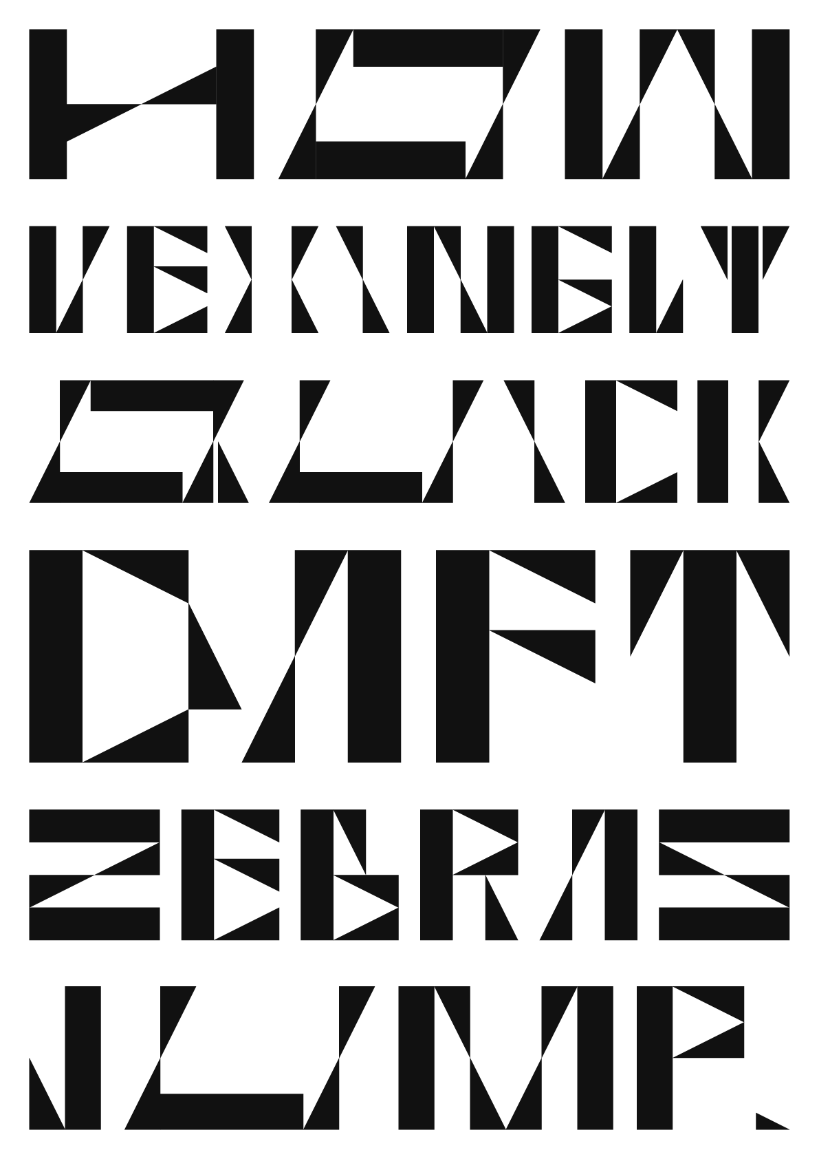
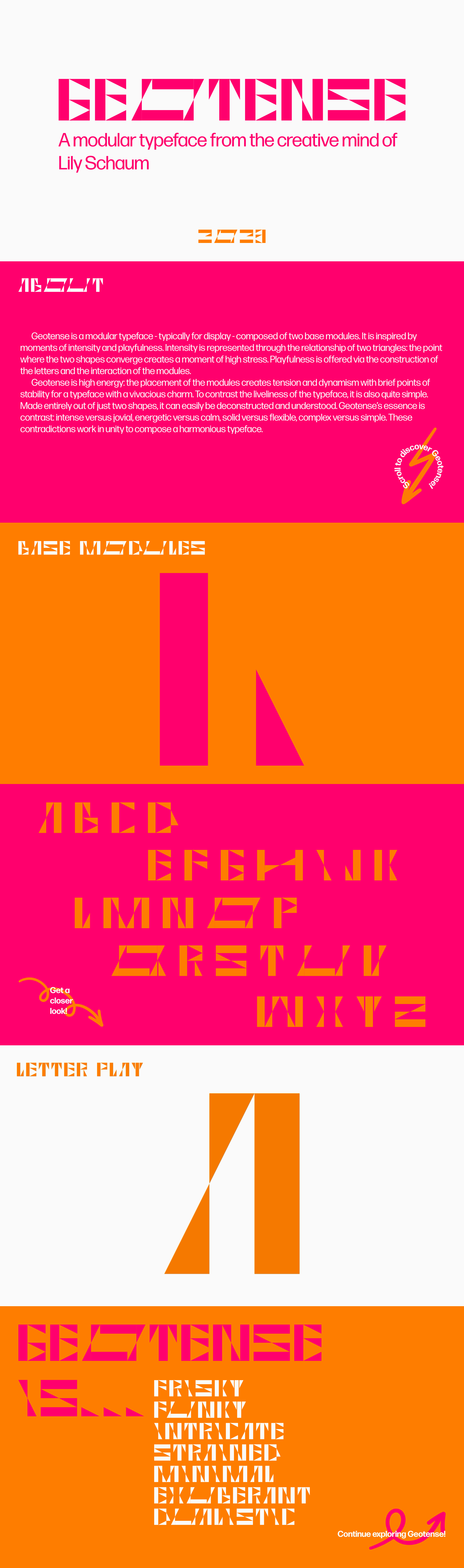
My first version of the typeface was named Quadrato Tre– simply named after the square and triangle modules as well as being in Italian because it was a project I did abroad. What I brought from first draft to second was a focus on the contrast between squares and triangles. I believed a typeface made using these two shapes as modules would be a challenge and create visually dynamic text.

Second Draft
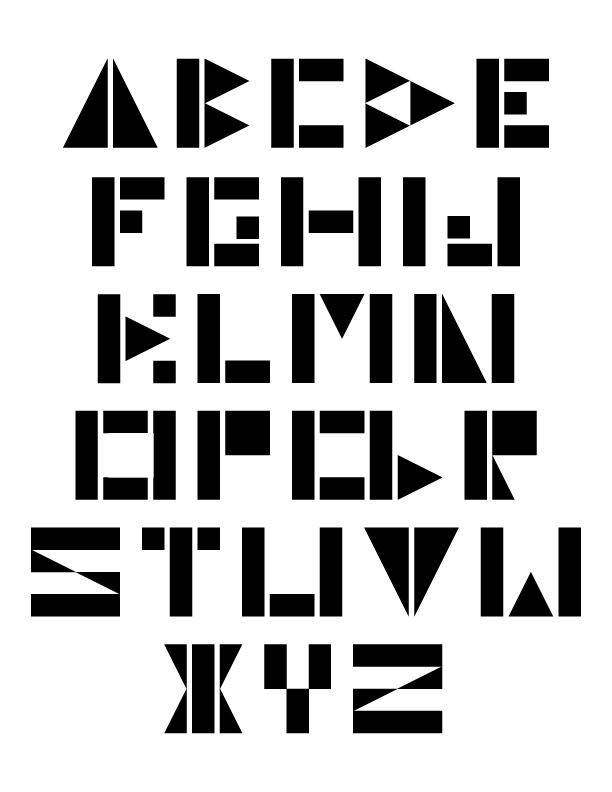
For the second draft, I used only two to three modules to construct each letterform. While this was initially challenging, it ultimately streamlined the design process and helped establish a clearer visual logic. Working within these constraints revealed structural relationships between letterforms—similar shapes could be templated and adapted to create others, making the system more cohesive. I began with simple constructions that used whole shapes to mimic letter parts, and as the design evolved, I refined these forms using smaller modules and consistent geometry. This approach brought a stronger sense of rhythm and uniformity to the typeface while maintaining the dynamic energy that came from the triangular module.


Final
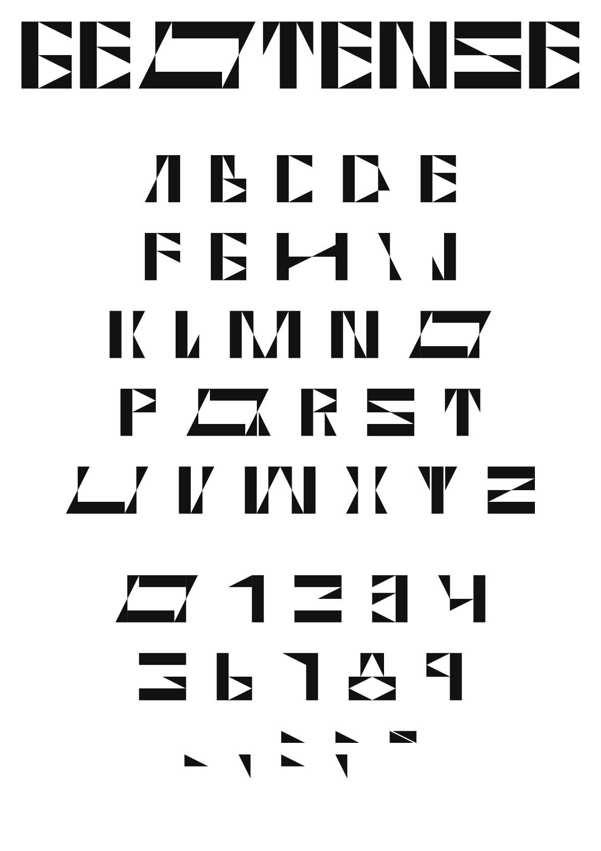
I named the typeface Geotense as a reflection of both its geometric foundation and the visual tension created by its forms. Built from a rectangle and a triangle, the system’s energy comes from the sharp interactions between these two modules. The angled edges of the triangle introduce a sense of motion and intensity, giving the letterforms an almost italicized appearance even though they remain upright. The name encapsulates this balance—structured yet dynamic, stable yet charged with movement—capturing the essence of what the project set out to explore.
Minisite
This is a single scroll UI design with 13 pages created using Adobe XD.

Reflection.
Reflection.
Designing Geotense taught me the value of structure, restraint, and iteration in type design. At the start, I was focused on complexity—wanting to build something intricate and clever—but I learned that clarity and simplicity can be just as impactful. Limiting myself to only two modules pushed me to think critically about consistency, proportion, and rhythm, and how small adjustments could completely change the character of a letterform. The project also deepened my appreciation for negative space and how it contributes to legibility and balance. Overall, Geotense strengthened my understanding of modular systems and helped me develop a more intentional approach to design—one that balances experimentation with thoughtful control.