
Fenice Type Specimen
Purpose & Goal.
Purpose & Goal.
This project was assigned to me during my senior fall semester abroad for my Advanced Type class. The limitation on the project was that the typeface chosen had to be from a limited selection of Italian type. I diligently chose Fenice, as many of my classmates hadn’t, with the determination to create something both original and intentional. The project required specific elements– including a front and back cover, table of contents, history, glyphs, and experimental pages.
My coursework during my fall semester in Rome was immersed in the world of all things editorial and publication design, which is highly reflected in this project. Fall 2023 was a really important time in my personal life and creative life, and my passion for both were reignited. This was the first time in my education a career in the editorial and publication space felt like it was possible, or even worth pursuing. It was this semester in Italy that gave me purpose, a sense of direction, and passion for design that I thought I had lost forever. I am very thankful for the experience and happy I am pursuing what I love.
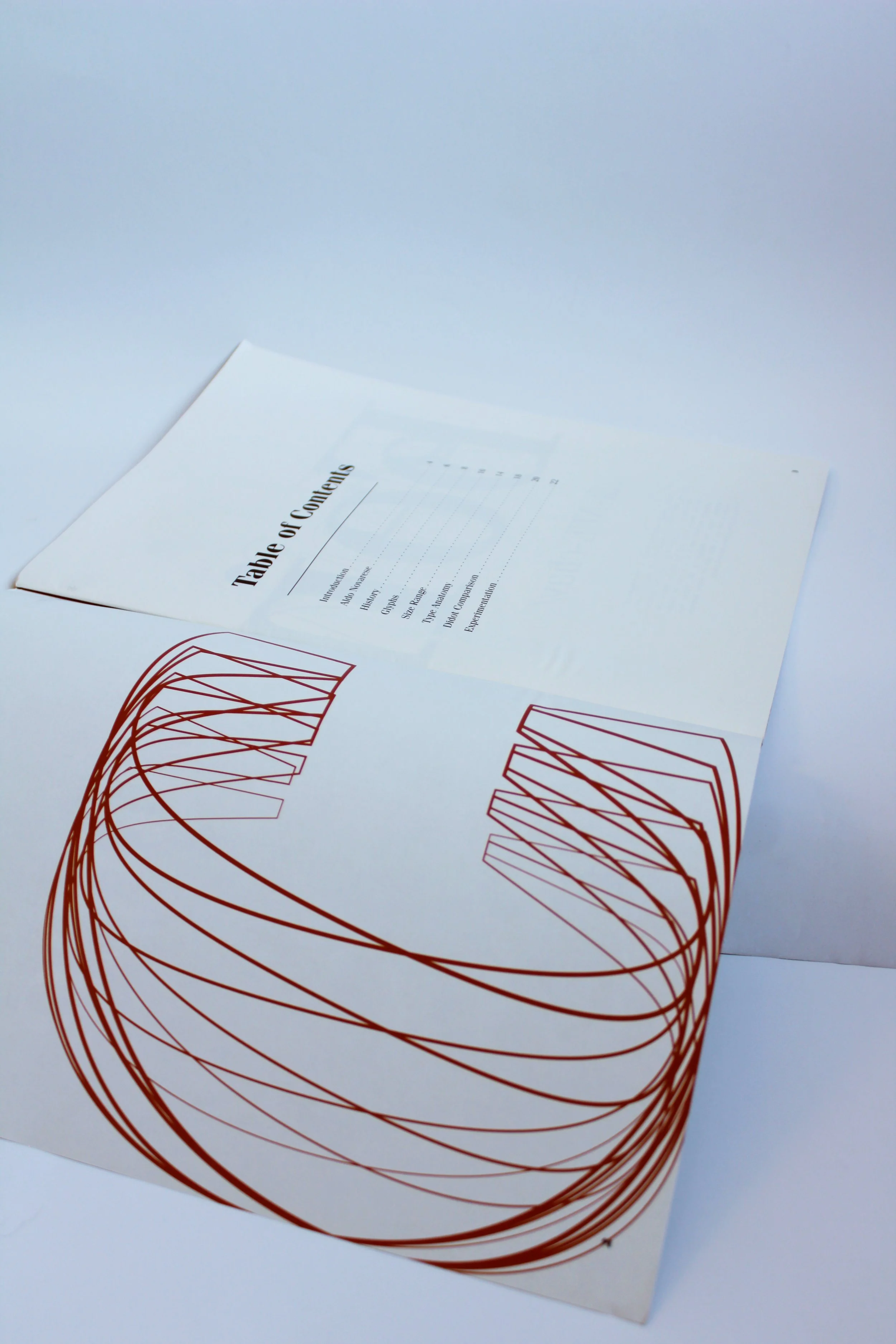
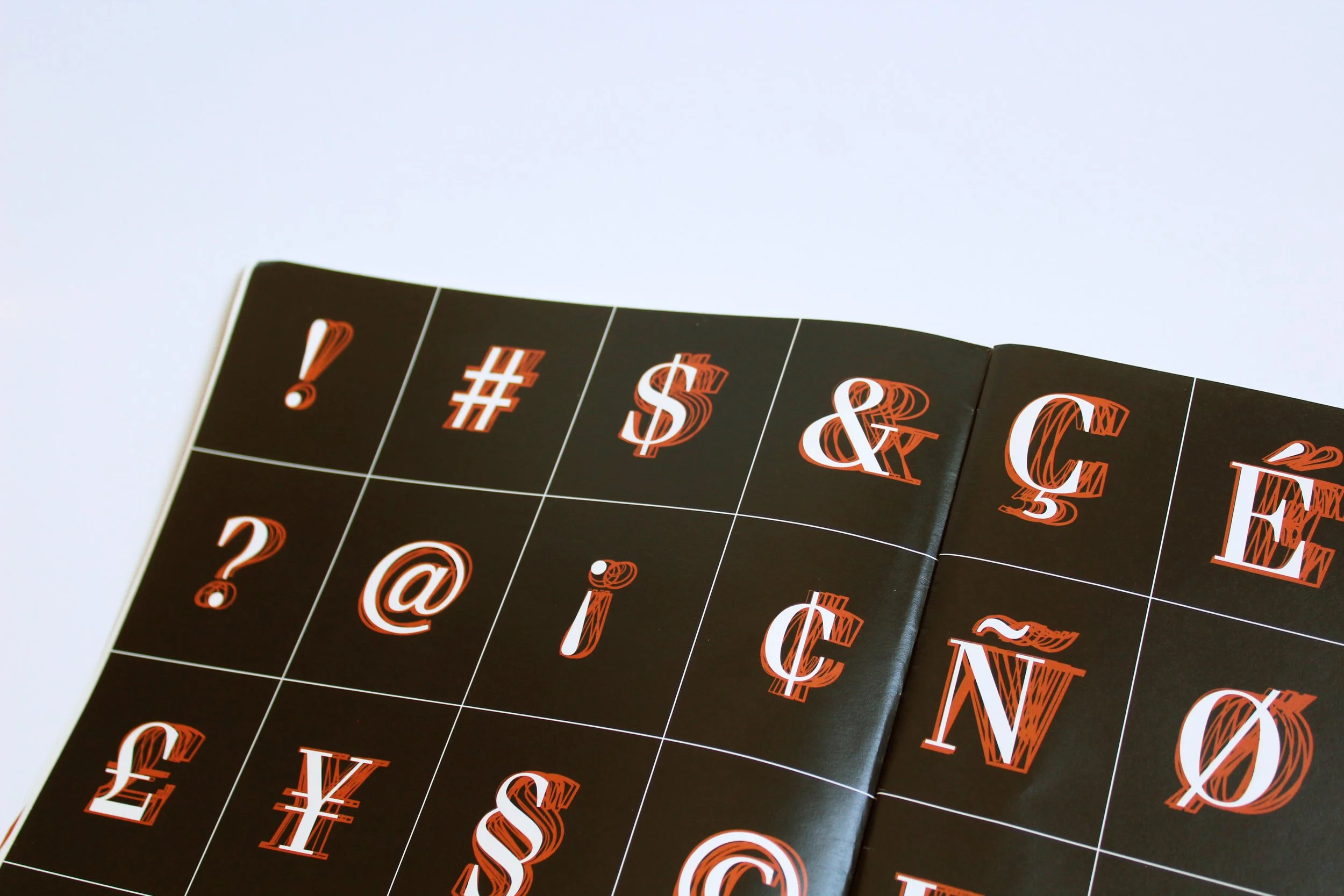
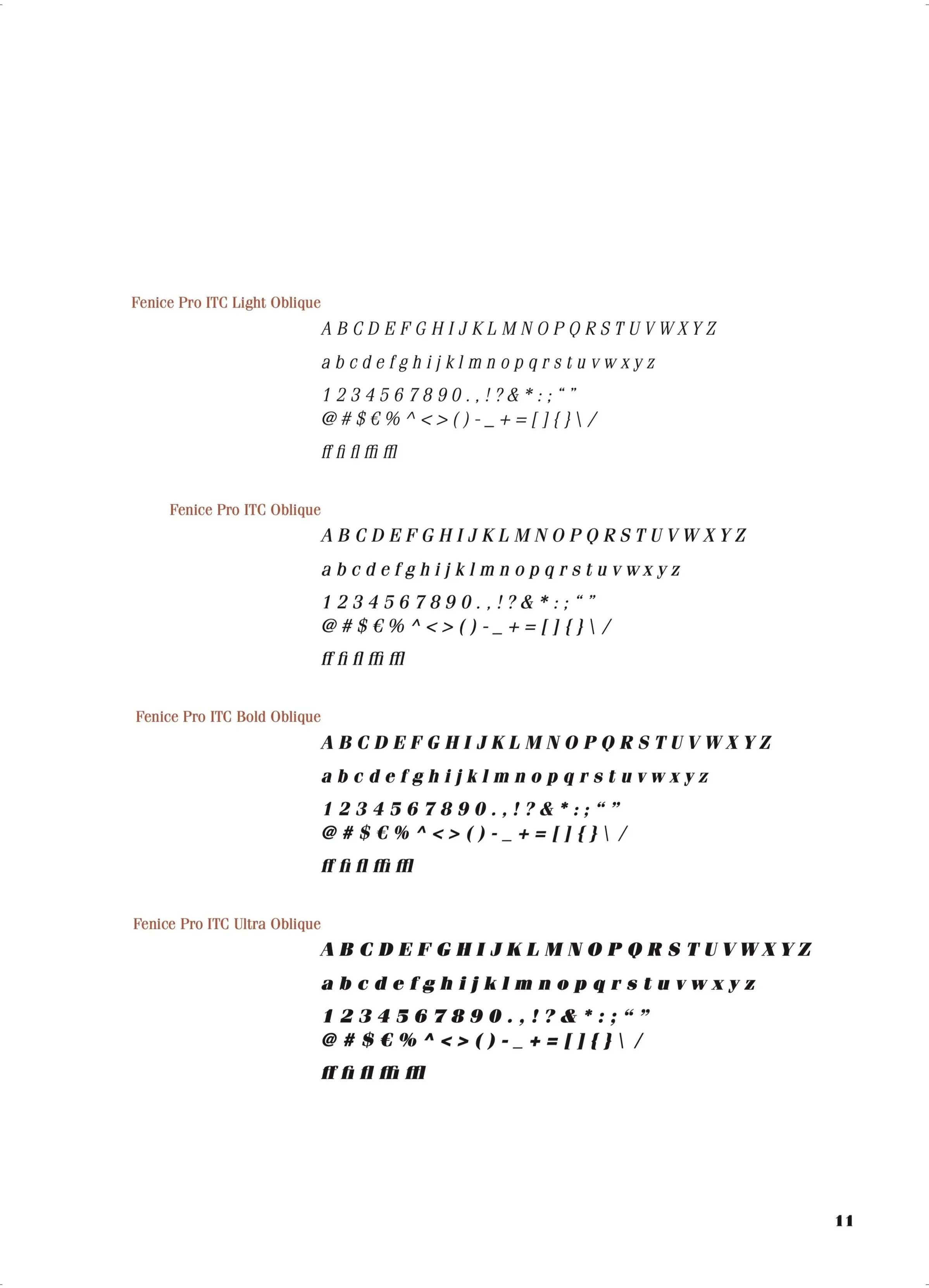
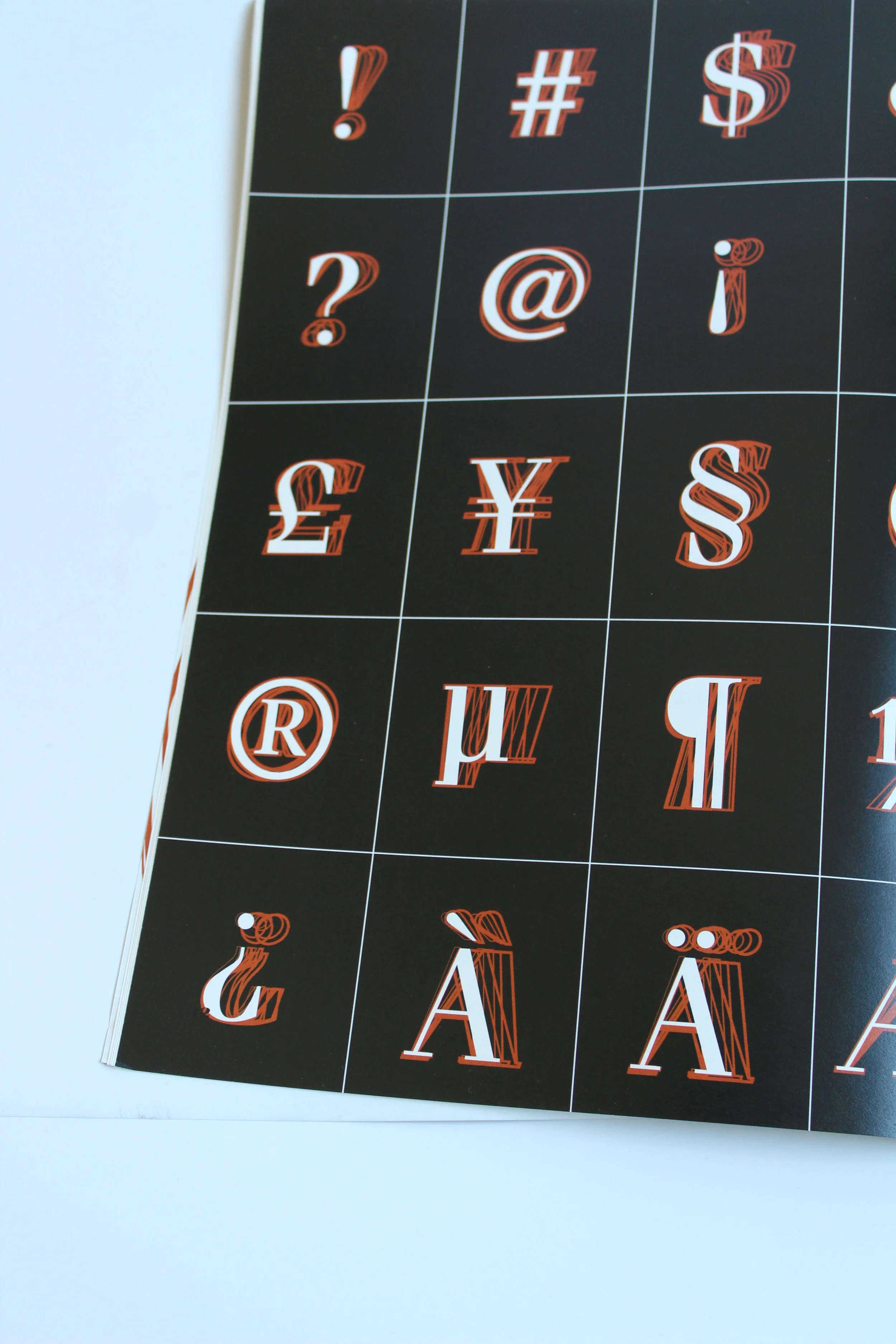
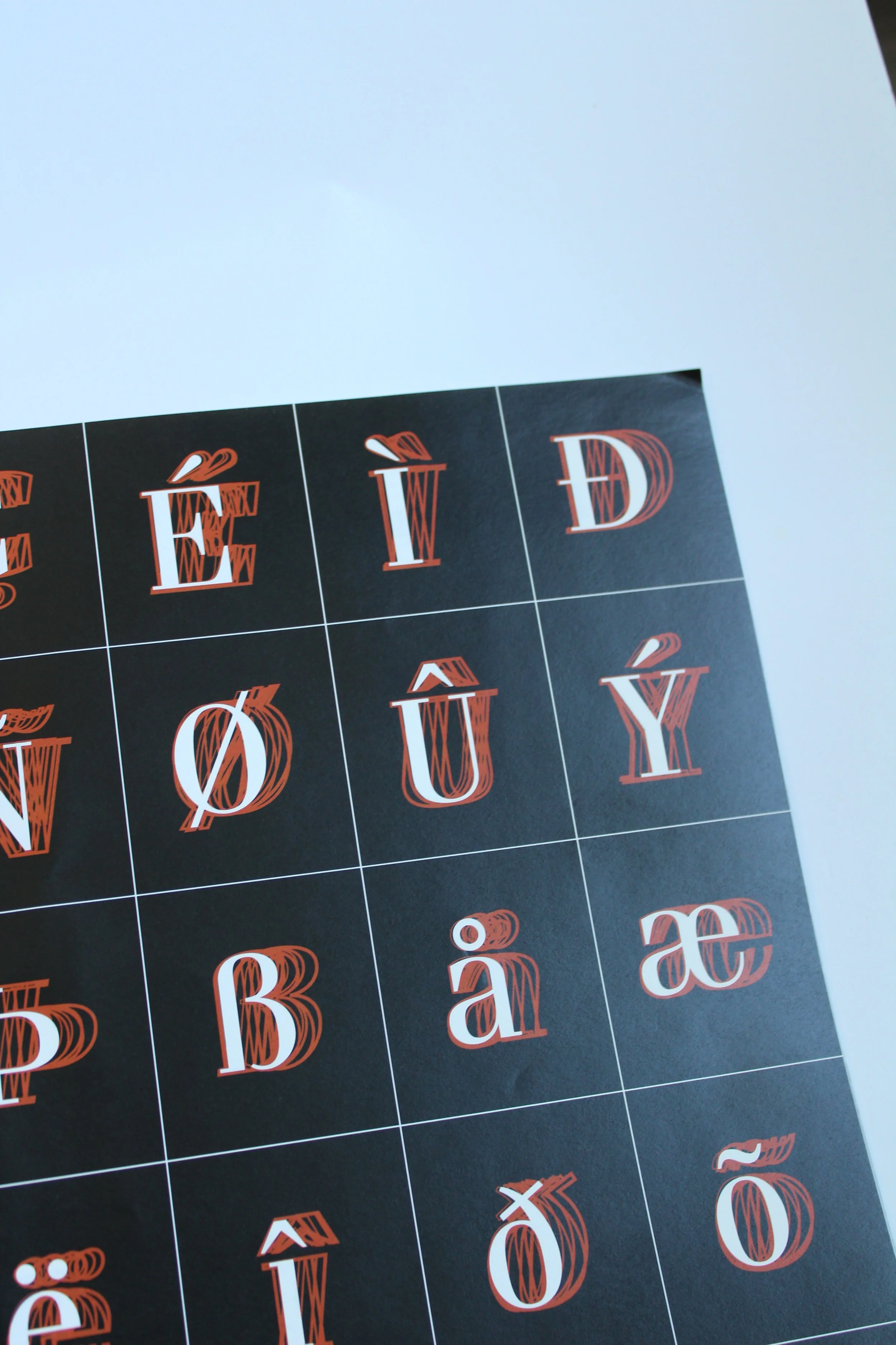
The Fenice type specimen intentionally showcases the typeface and many of its potential design applications. The specimen highlights the complete Fenice font family, including all glyphs and fonts. The front end of the book establishes a bit of history comprising of a brief background, the creator, and Fenice’s history. The core of the specimen are the more technical pages, a bit more illustrative, but a closer look at what the letterforms of Fenice look like. Then the book ends on a high note of interesting experimental visuals exploring the applications of Fenice. These layouts explore practical implementations of Fenice, intended to inspire other designers in their own creative work.
My personal goal for this project was to create something simple and elegant. I wanted to create seamless visuals throughout the specimen using a refined color palette. Editorial work is my favorite and I was excited to finally have guidance and learn from professors that were also professionals in the industry.


“…[it] was a really important time in my personal life and creative life, and my passion for both were reignited.”
Process.
Process.
-
Initial Research
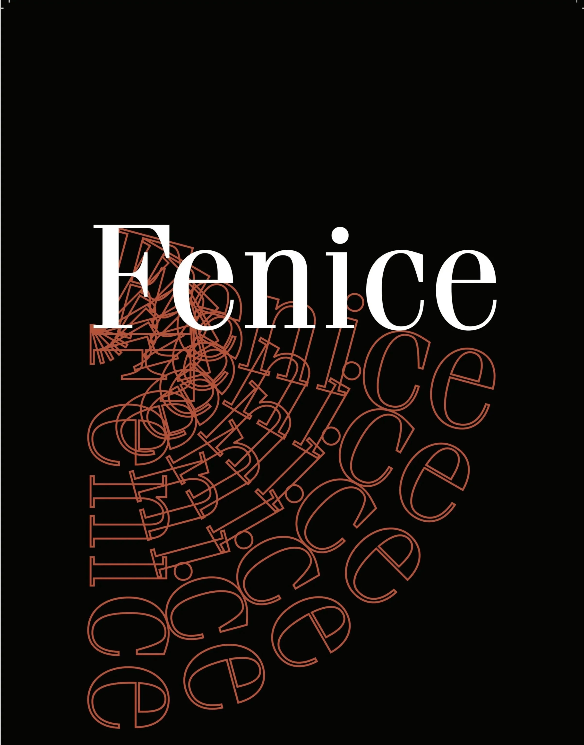
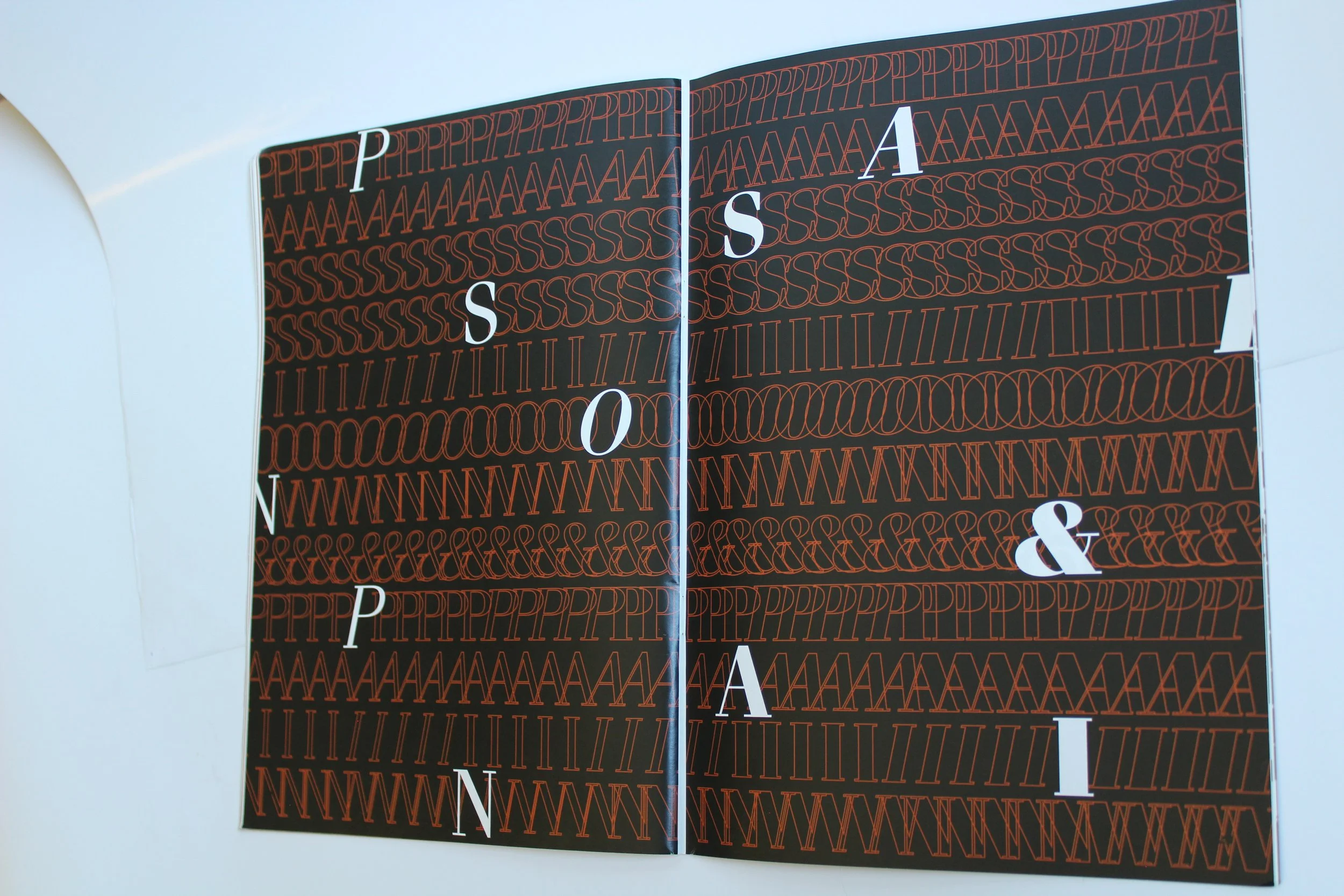
After doing my initial research and learning about Fenice’s creation and elegant structure, I knew I wanted my type specimen to be simple. I opted for black and white as my main color palette for a timeless feeling. I chose a deep orange to highlight the typeface. The choice was as a nod to Fenice’s name and its elegant, calligraphic features.
-
Process
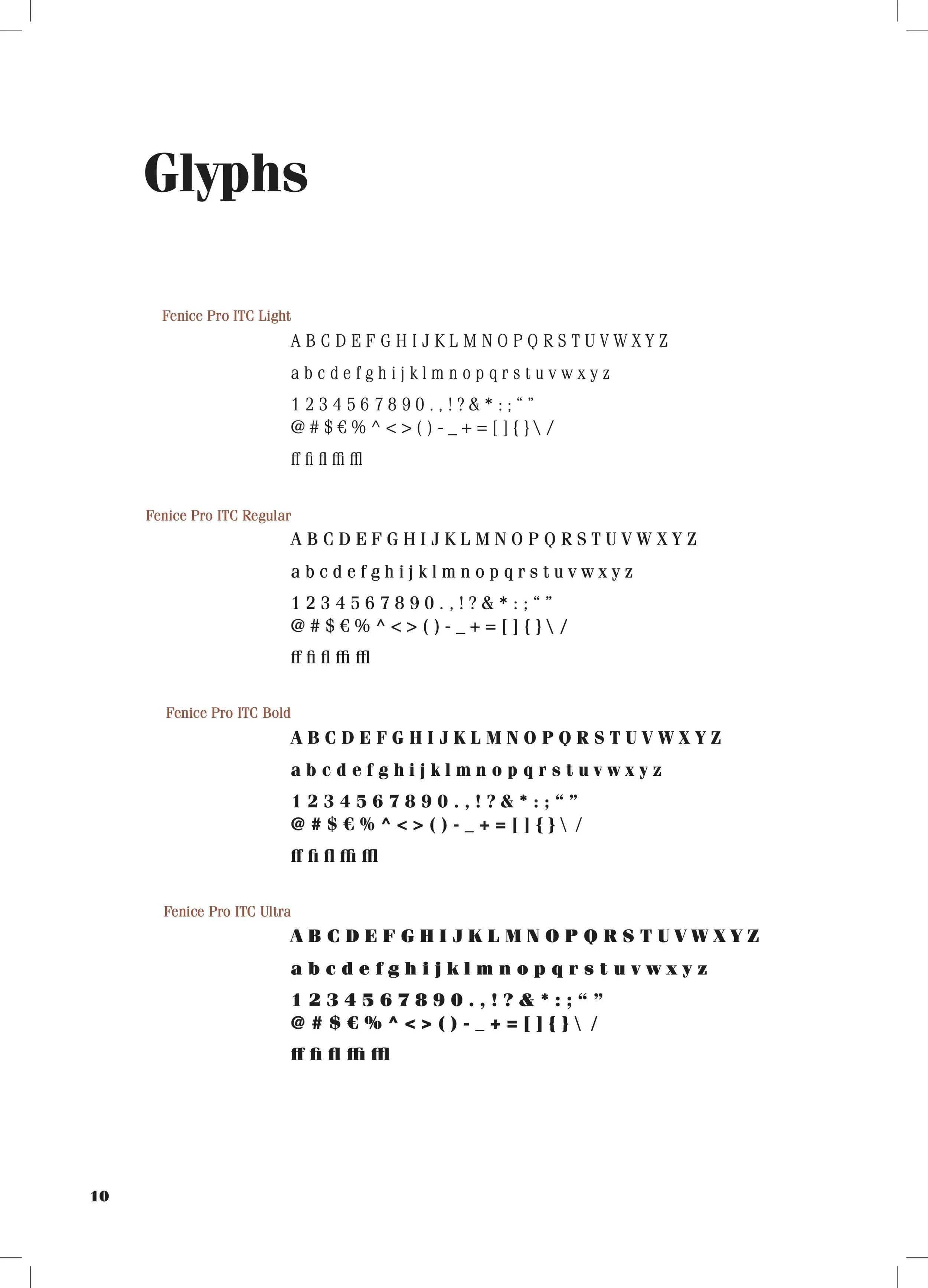
After choosing a color palette I also had to determine a visual identity that would create cohesion throughout the type specimen. It was important to me to showcase all of Fenice’s fonts, so as to show its versatility. I began experimenting with outlines and highlighting letterforms. Eventually, I found a way to blend using this technique with showcasing the different weights of Fenice.
-

Development
Having established a reliable visual formula, I employed it by offsetting blocks of text with engaging layouts. Visual hierarchy was still important to put in place, but the focus was to create engaging editorial visuals that felt relevant and kept the viewer’s attention.
-
Refinement
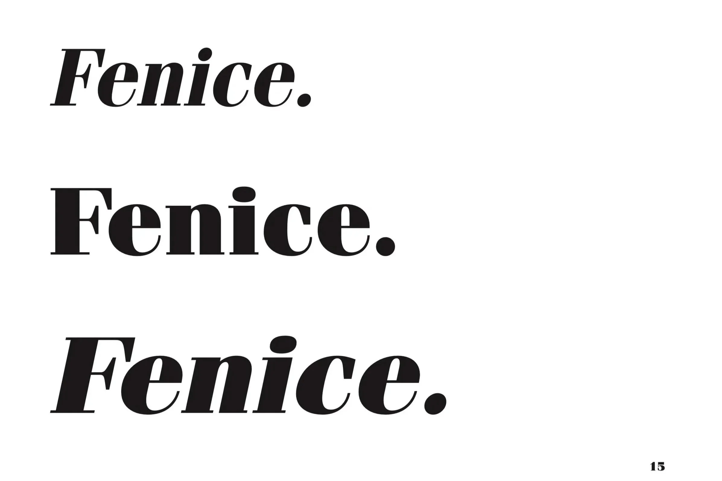
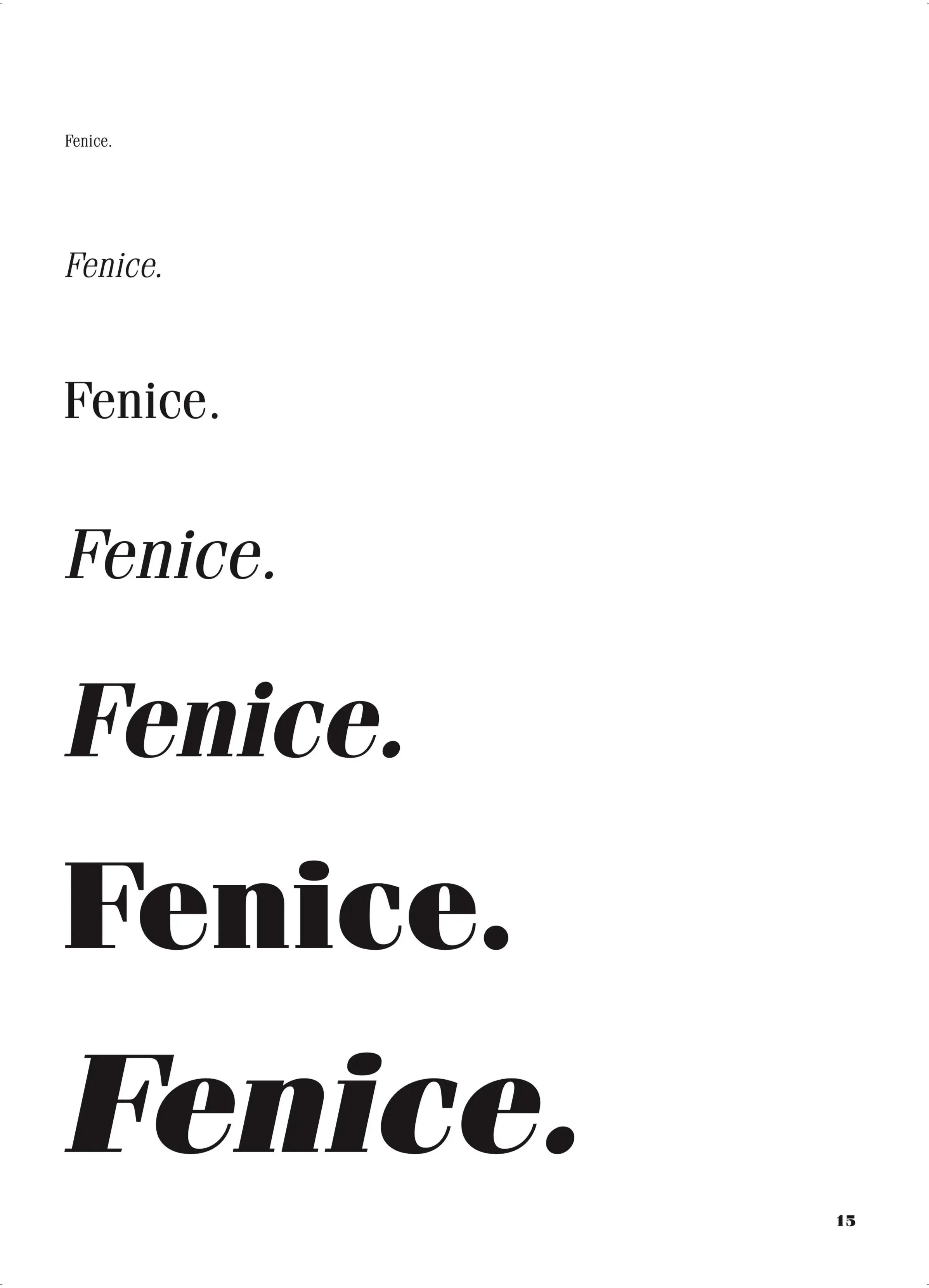
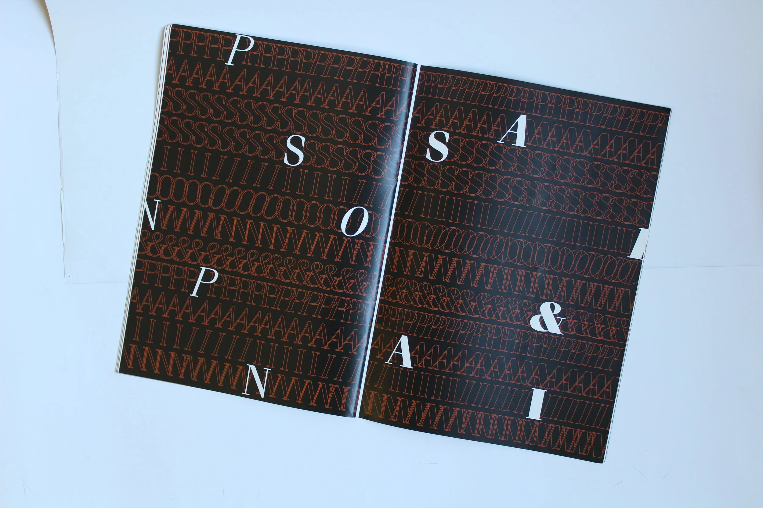
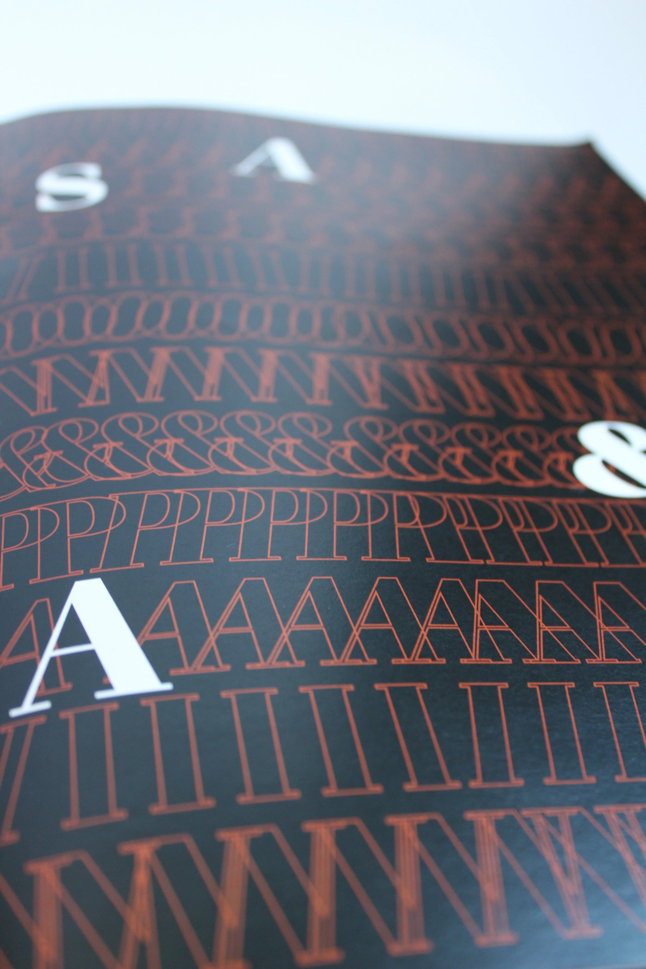
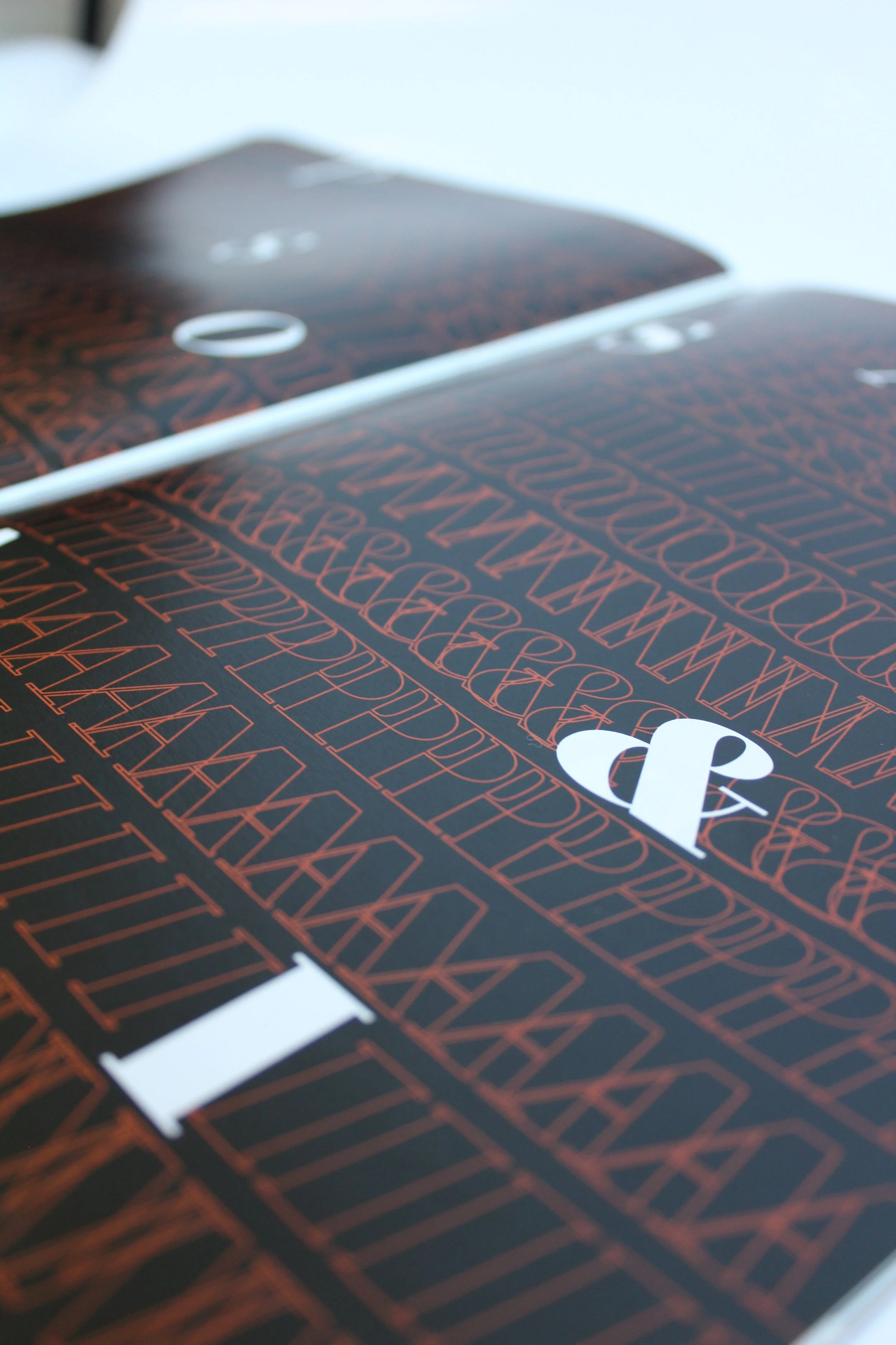
I wanted the type specimen to feel cohesive, but have a lot of engaging visuals throughout. I feel that my color palette made that challenging at times, but in the end it made the visuals thrive. What I am most proud of is the slow implementation from beginning to end of the visual system. It is barely noticeable at the start and by the end it is full-spread. In some cases it is used as just an outline and sometimes it juxtaposes every weight of Fenice against the regular weight.
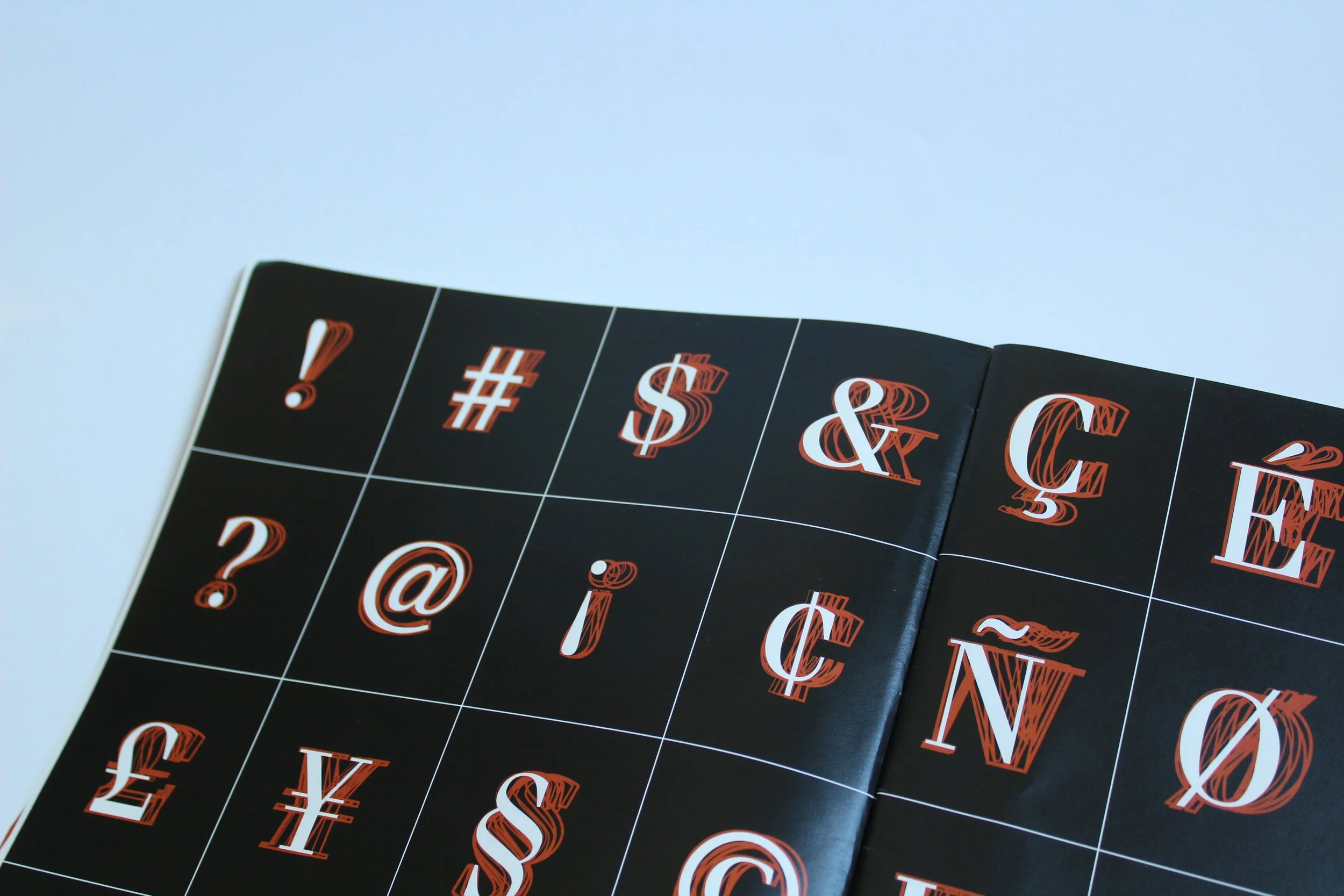

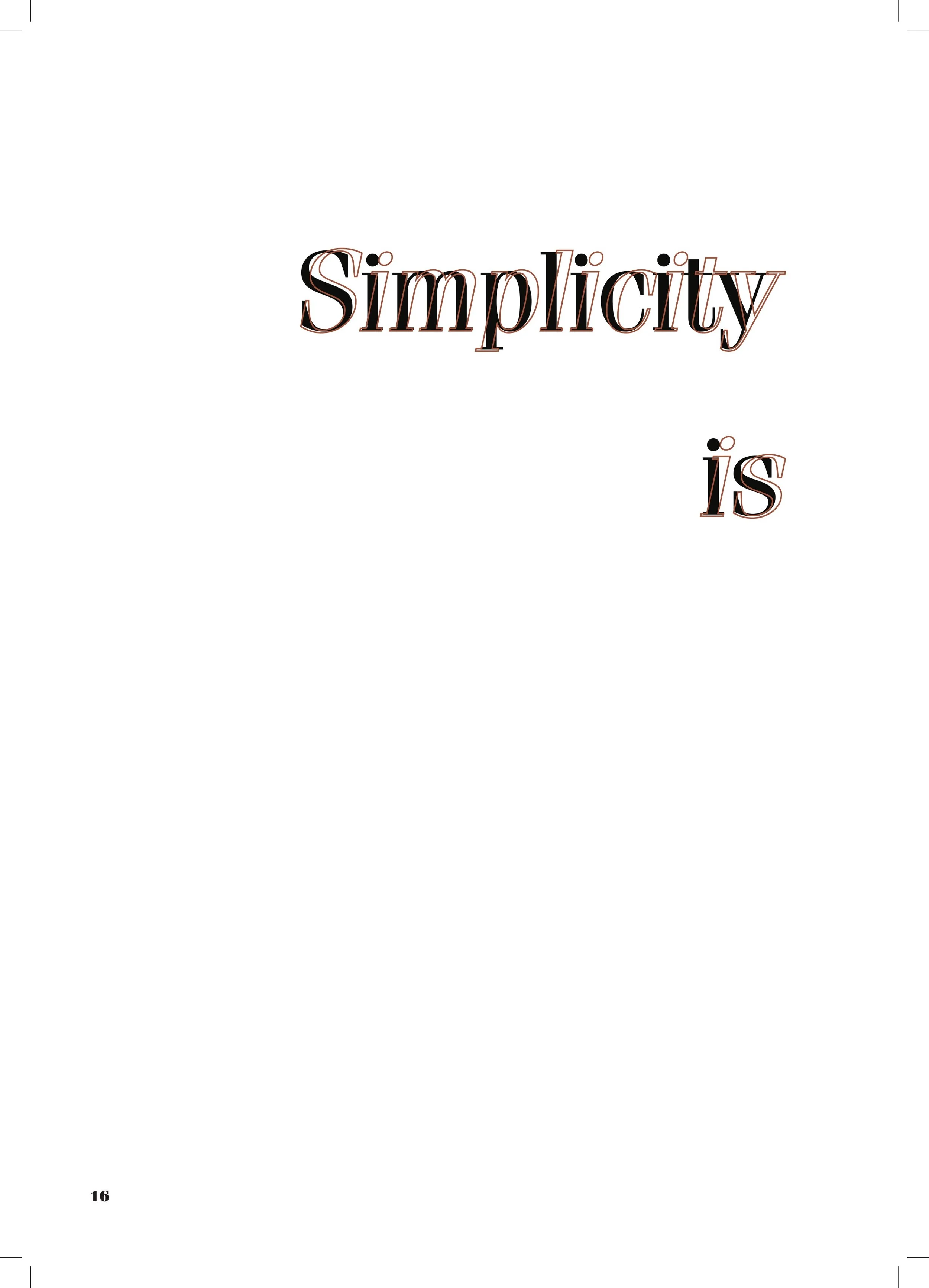
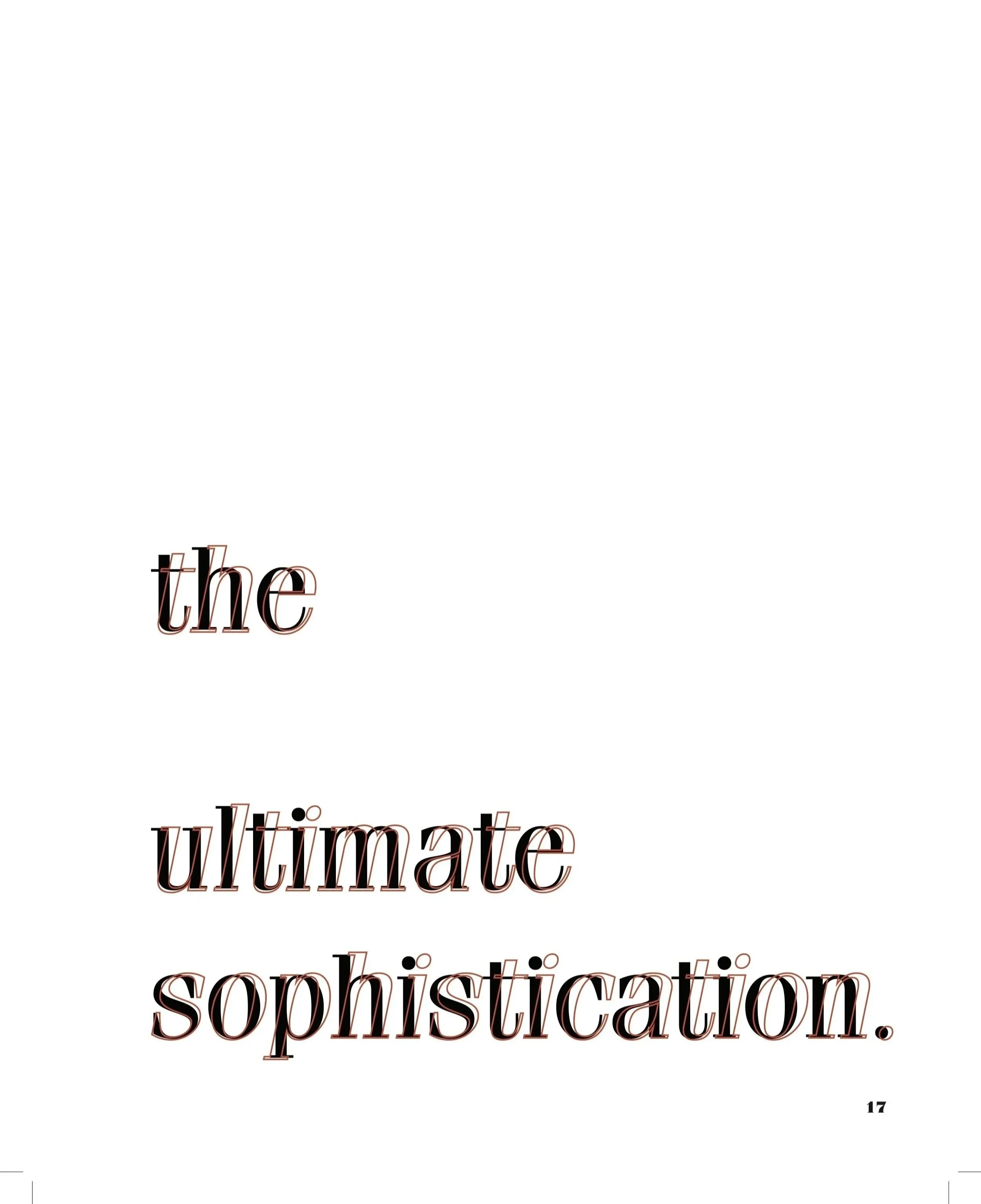
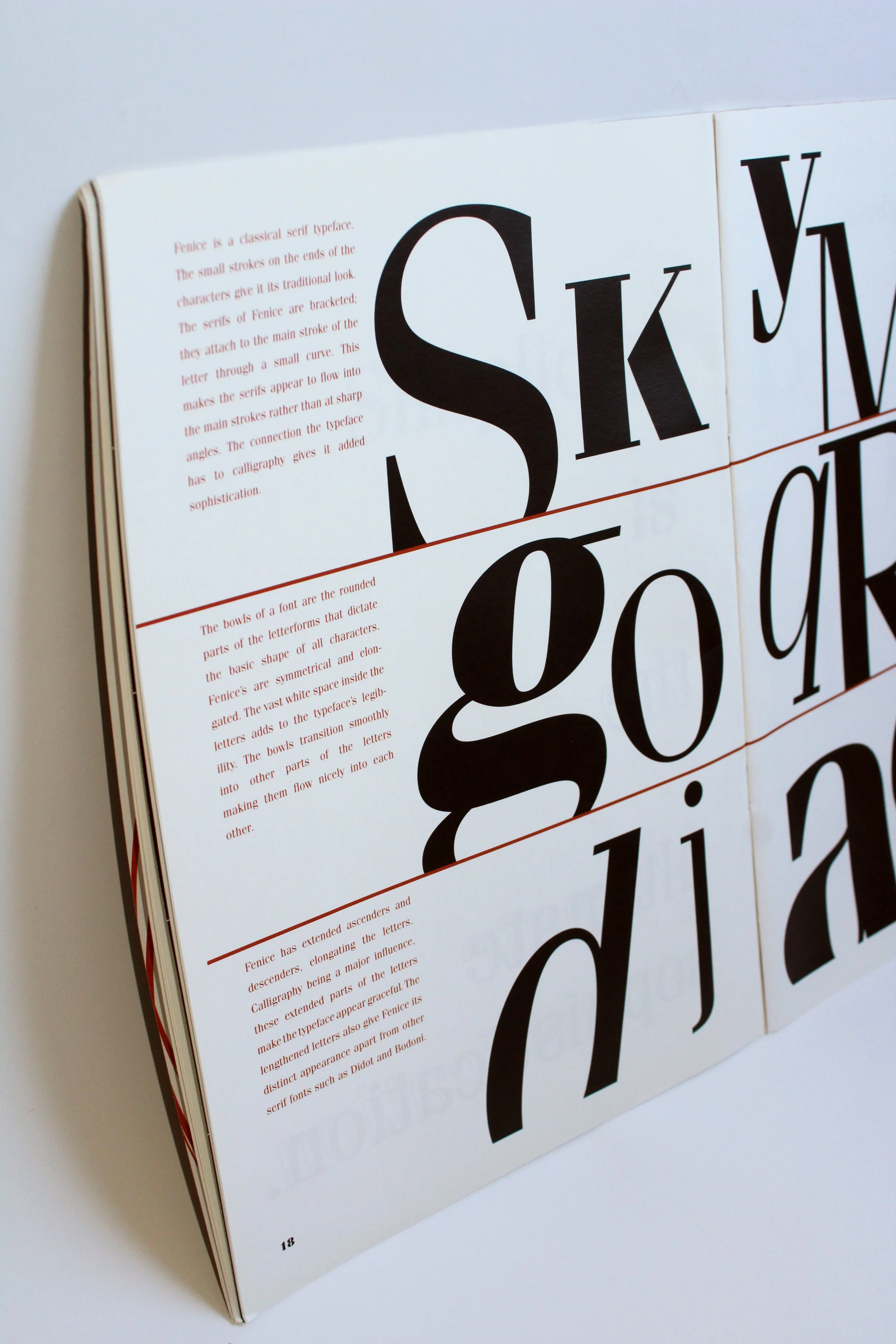
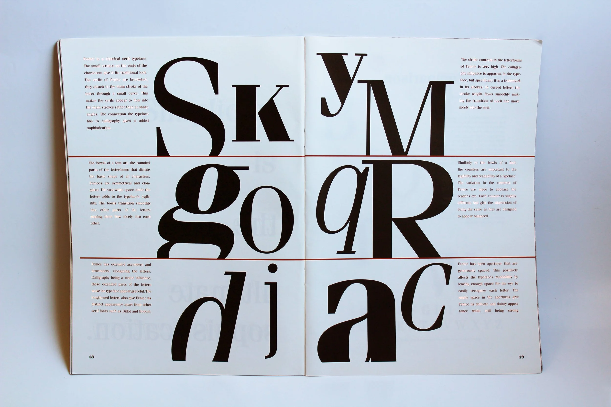

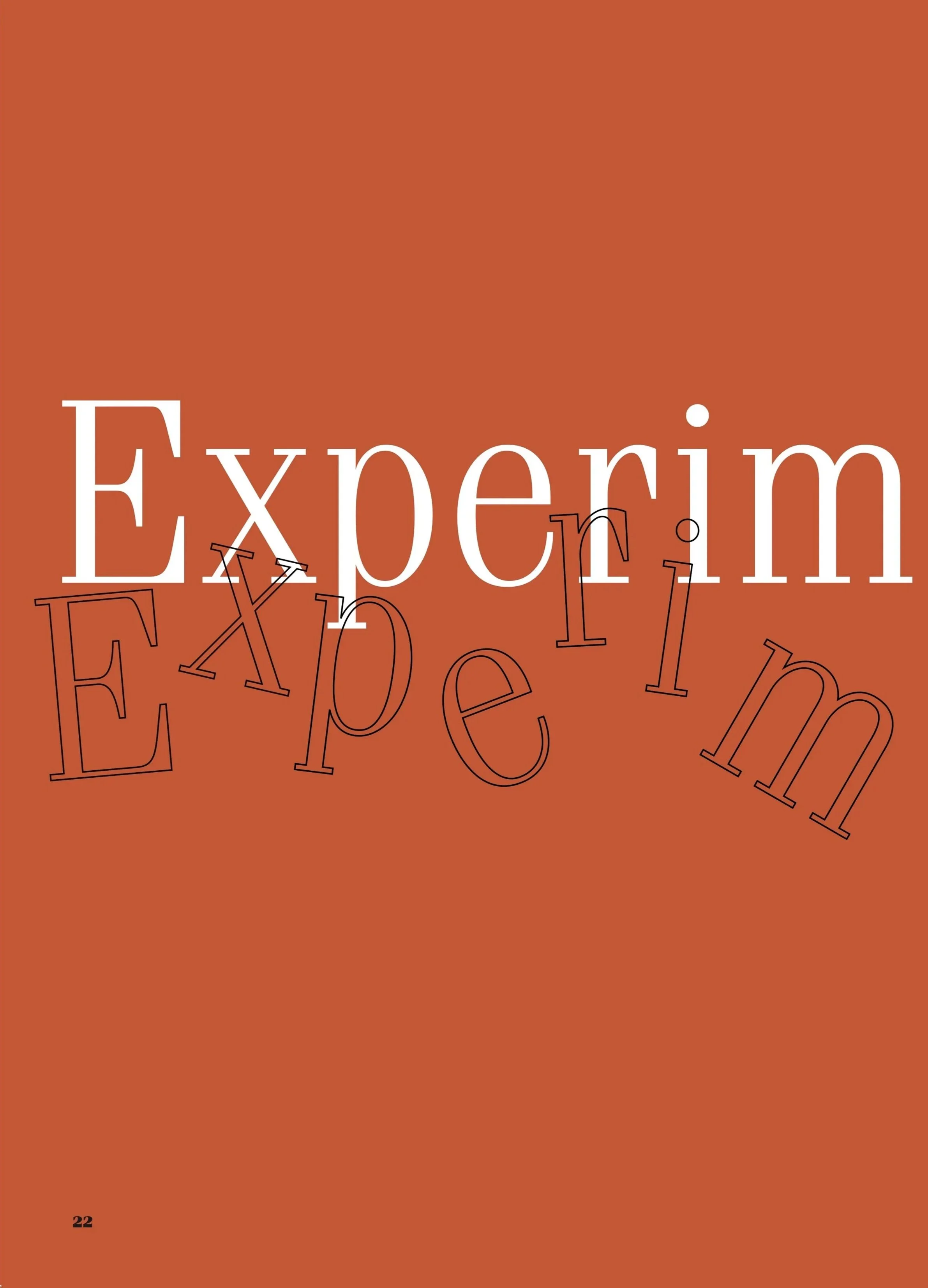

Experimentation-focused layouts were interesting to create. I took what I learned about Fenice’s appearance and applied it to make visually stimulating layouts. The contrast in strokes, its extensive font family, ability to read as headline or body copy, and its delicate yet bold features were my focus when experimenting. Fenice’s stroke contrast and magnifying the structure of a letter are what inspired page 31’s composition. Other compositions focused on showcasing Fenice’s versatility through displaying it jauntily across the page and in its more delicate state as a block of text. The outline, or juxtaposed weight visual, was expanded in this section as well. Instead of using it to create simple and stagnant compositions, I started exploring using the effect across entire pages, radially, and to emphasize certain words.
Color played a huge part in the experimentation phase of this project. Having a simple color palette allowed me to draw the eye in or make a composition bounce off the page. The orange was effective in creating contrast and cohesion. Bouncing around between background colors and considering which compositions were bold and which were busy was essential in arranging pages. Visuals needed to be evenly distributed in order for the viewer to remain engaged and wanting to turn to the next page.


reflection.
reflection.
This project was a fun introduction into the editorial world and my semester abroad. It was new and challenging while also intriguing and exciting. I found it to be everything I was craving from my curriculum back home. I was excited to finally be able to strengthen my skills in the area I aspired to pursue. This project was the perfect balance of structure and creativity– balancing information with engaging visuals. Creating a visual system and writing my own copy is something I love doing. This project gave me the information I needed to know that publication design is for me. My professors were very encouraging and lovely. They are a huge reason I fell back in love with design.