
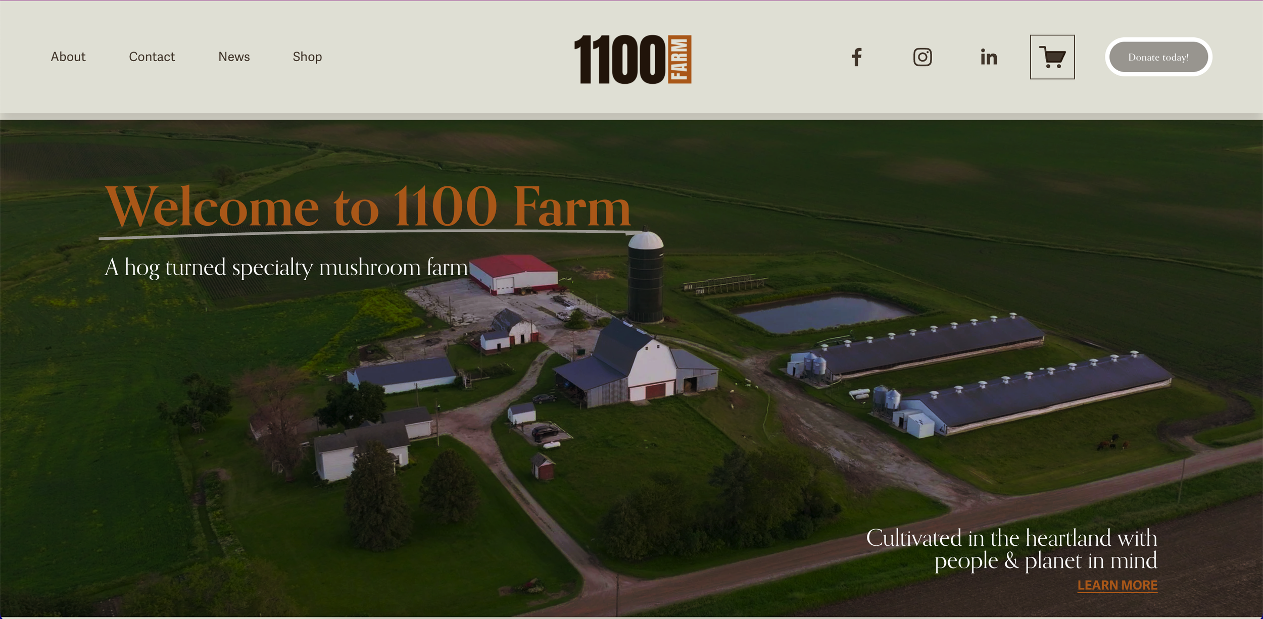
1100 Farm–– A specialty mushroom farm that sells fresh produce, items such as tinctures & lion’s mane coffee.

Purpose & Goal.
Purpose & Goal.
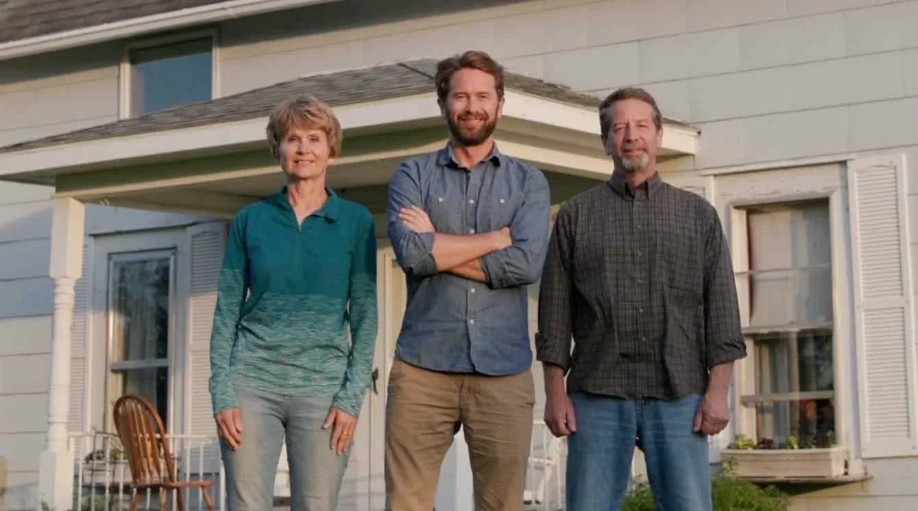
This project came about through networking shortly after moving to a new city. I had the opportunity to provide graphic design support for Good Burt Media on a project with 1100 Farm, a former hog farm turned specialty mushroom farm focused on sustainability, profitability, and community-building. The goal was to develop a series of conceptual advertisements and a mini brand aesthetic guide that highlighted both the farm’s products and its values. While the initial request was for four ads, I set out to create a broader variety of layouts, imagery, and approaches—balancing brand-focused and product-focused designs.
process.
process.

At first my ads were geared toward social media, but after consulting with my fellow designer I had a much more clear sense of direction. I wanted to give 1100 Farm options in tone and style. I approached this with the system of designing two versions of each ad: one direction used the existing brand colors, while another introduced a refreshed mushroom-inspired palette paired with EB Garamond as a stand-in for their original typeface, Orpheus. I then created two mini brand aesthetic guides to demonstrate how brand identity visuals come into play. Calls to action emphasized community, education, and product highlights, while eye-catching photography reinforce engagement.
initial ideas.

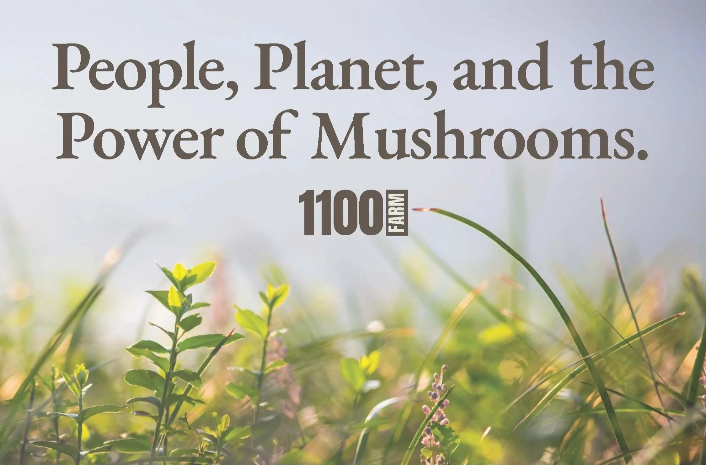
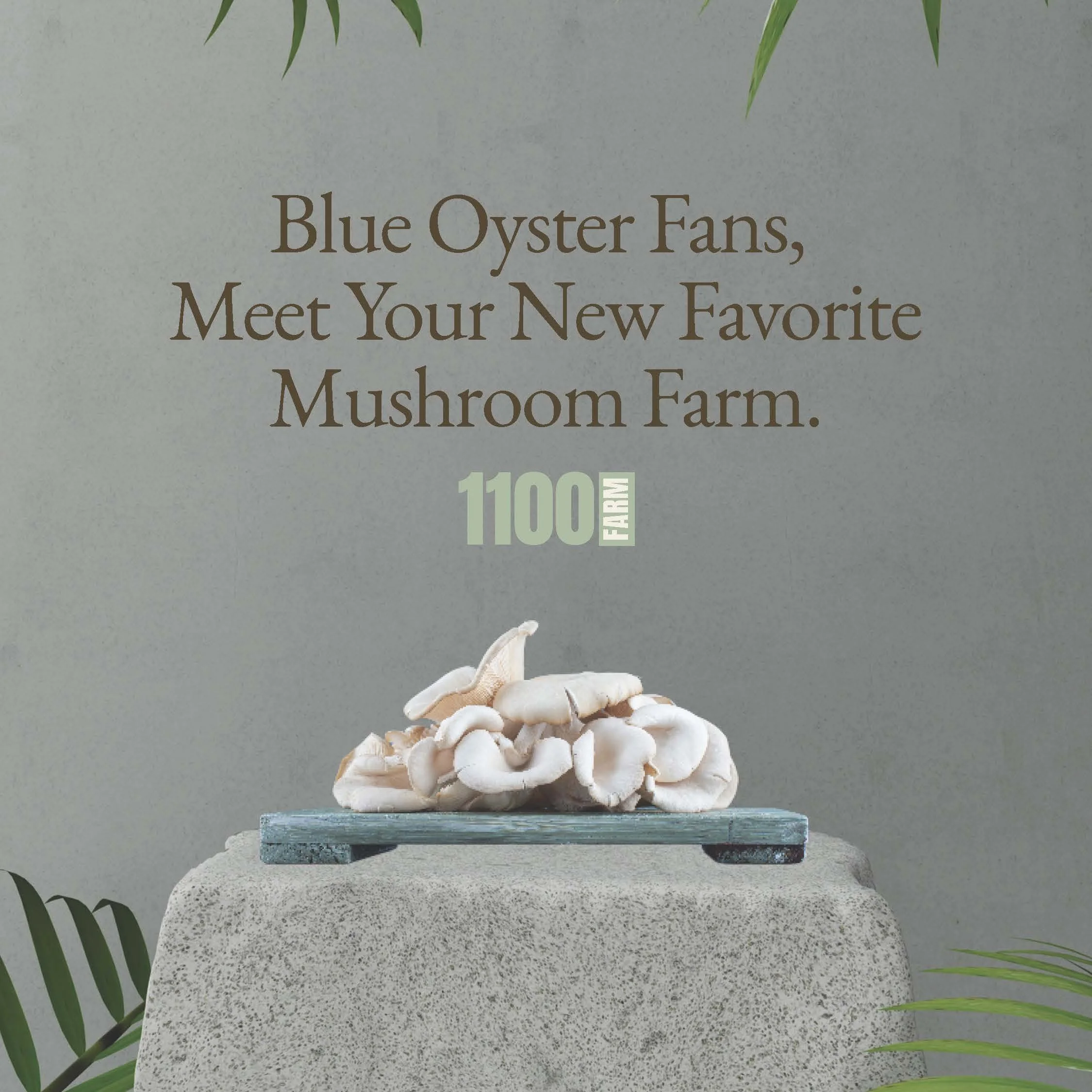
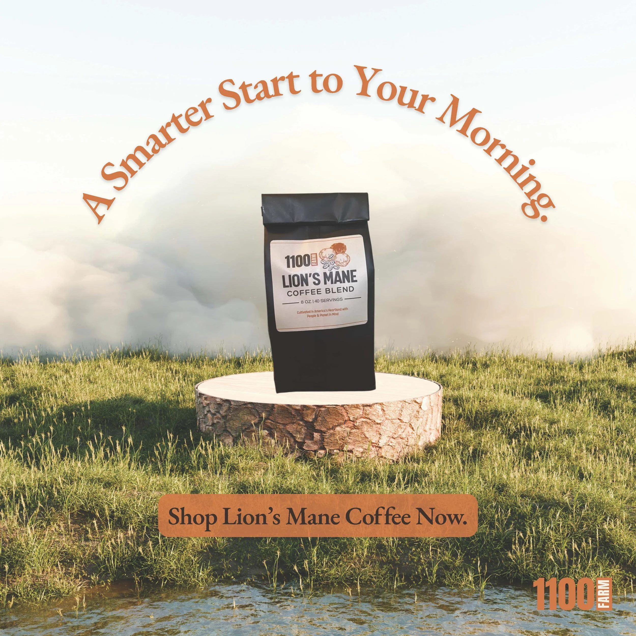
As I was creating the advertisements, I wanted to breathe new life into this company. From an outside perspective it seemed the company was business oriented and a refresh could be exactly what they needed to launch into new markets and better connect with their audience. My two-version approach consisted of changing the color palette and the logo treatment in each. The ads themselves are the same; I did this so they could see the impact that new brand colors have on the same advertisement. Imagery and copy were focused on building community and information on mushrooms. The atmosphere I was trying to create was light, airy, natural, and inviting. The font I chose was EB Garamond, it was similar to Orpheus. I think it is a classic typeface, inviting, quite simple, and readable.
Development.
In refining the advertisements, I focused on making them feel rooted in Iowa while still carrying the qualities of lifestyle ads. The goal was to create visuals that felt inviting, natural, and almost dream-like—showing the farm not just as a producer, but as part of a community. By experimenting with two versions of the brand system—altering the color palette and logo treatment while keeping the ad layouts consistent—I was able to demonstrate how refreshed branding could shift the overall perception of the company. The imagery and copy centered on mushroom education and community building, while the EB Garamond typeface supported the design with a classic, approachable, and highly readable presence.
Refinement.
1100 Farm
Each ad is shown in 2 versions. The first is designed utilizing 1100 Farm’s existing brand colors. The second version is in a refreshed brand color palette I chose to implement.
conceptual ads


1100 Farm
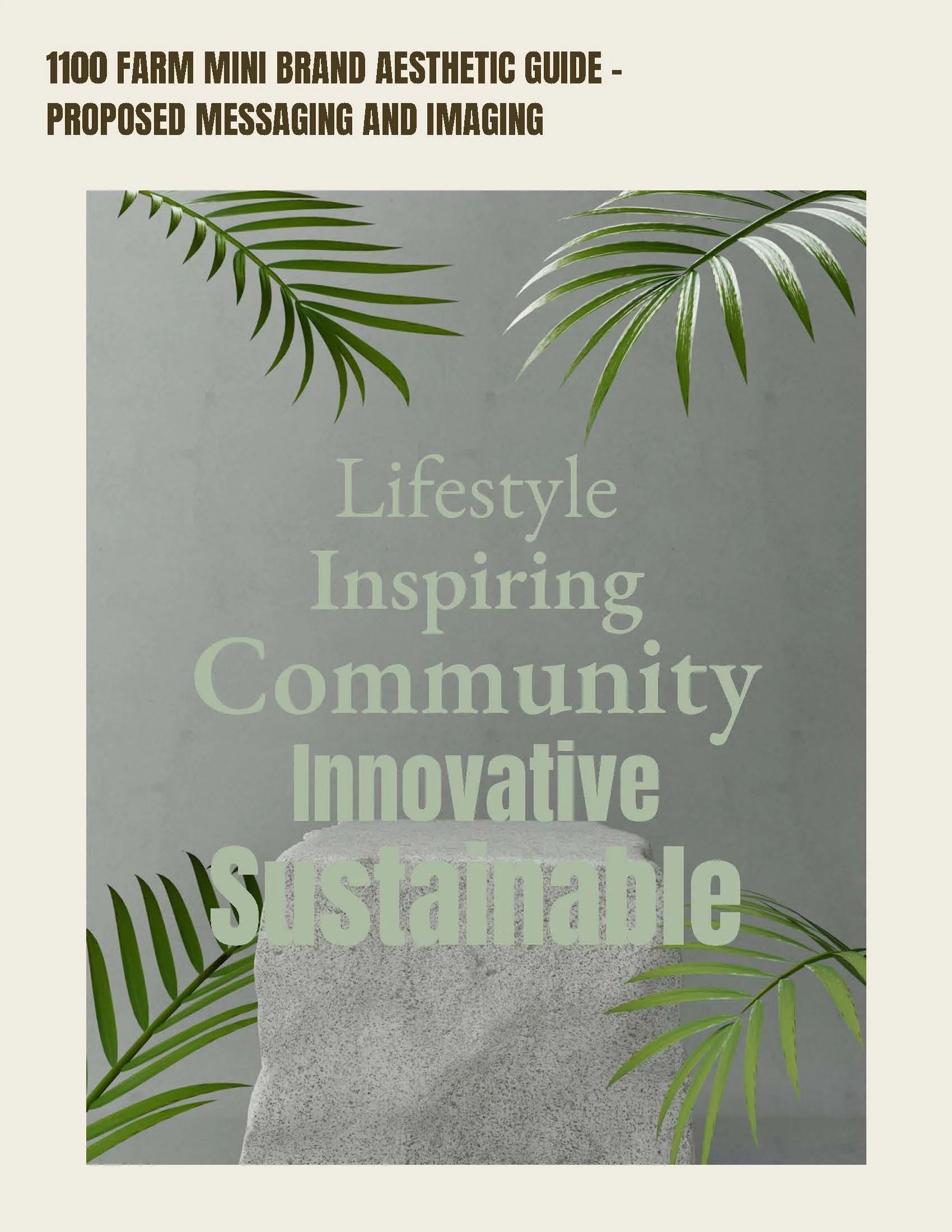
This mini brand guide aesthetic is to inform 1100 Farm of the brand guidelines, mood, and tone of the advertisements. This is to use for existing ads and to be used as a reference for creating new brand materials.
mini brand aesthetic guide


reflection.
reflection.
This was my first freelance project and I was very happy to have been able to be a part of it. I think 1100 Farm is a great company from my research working on this project and my collaborator was great to work with! Even in a small role, I felt extremely fulfilled and was ecstatic to be working in the field. Designing in advertising was new to me, but with guidance I feel that I caught on quickly. Designing something meant to have a high click-through rate was something I had not considered and it pushed me to be more strategic about my layouts. The experience working on this project gave me the confidence I needed to pursue working with real clients and grounded me in the professional world I felt lost in.